
Monday, 29 November 2010
Poster/Advert
I have looked at the advert for the digipak that Jack and Max put together. I really like the use of birds which links to the cover. However it does not include a border to seperate the image and the rest of the poster. This could be a weakness as it makes the ad look cheaply put together and will maked it harder for the potential audience to recognise the product. So I have chosen to edit the design slighlty and add a border which is comprised of colours present in the background image. I then chose to open this with photoshop and use the blur tool on the border. This will distinguish the digipak cover from the background whilst also giving the visual impression that the digipak cover is sharper and more distinguishable
 Given time I would also add banners to the name which would be centralised and include a date in bold text underneath the digipak cover image. This will make the advert more professional looking as well as making the name and release date of the band and album respectivley more noticeable to a passing member of our potential audience.
Sunday, 28 November 2010
Digipak poster- Bantry Bay - finished product

Photoshop was a great tool for making a poster because it meant I could use layering, putting all the image I wanted into one big image. It also has a useful tool in which allows you to chop and change the colours, therefore making it easier to stand out.
Digipak Poster -Bantry Bay- 1st draft

Friday, 26 November 2010
Evaluation | Jack Poole
In what ways does your media product use, develop or challenge forms and conventions of real media products?
Conventions that we used
Conventions that we used

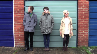
 Our band shot is an example of a indie convention which we used in our music video. The shot is positioned outside a pavilion. It gives a minimalistic , low budget and quirky feel which is typical of our genre. In this shot you will notice that max is using only a snare drum, this helps portray the quirky and different independent style of the band. Playing outside gives a natural and original image, often also seen in folk music, to the band as if they are playing for an audience as they are. The dress in casual and easily affordable so fans, whom for this genre are usually quite young and don't have a disposable income, can copy the bands style without the large costs that would occur if you were to try and copy a pop artist who usually have a big ego and are commonly only interested in the money rather than the music. This can help in keeping a parasocial relationship with their fans as the fans can relate themselves to the band and mimic their style. This can be linked to the theorist Horton and Wohl who developed the parasocial theory.
As shown below there is a similar shot of the band "Bombay Bicycle Club" who have also chosen to show the band in a typical way resembling our location.
Despite the indie image being quite low budget there is plenty of artistic creativity involved in the misé en scene. This is shown over a large majority of indie videos and can be seen in the innovative "Ok Go - Here it goes again" treadmill idea. We adhered to this convention by using local resources to create a colourful and typical scene perfect for our music video.
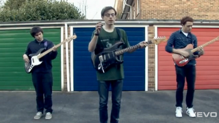
In this shot, also from "Bombay bicycle club", you can see it gives there music video a colourful vibe. In this show however each garage is shown behind a different band member and separates them by colour in a unique way which looks good.
Conventions that we have developed

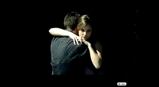
In this shot we use a mixture of low key lighting and a black and white effect to emphasize the difference between the relationship storyline which had happened in the past and the band shots. This technique has been used in various different indie video's to imply a change in scene or time so once we researched it we decided that it would make a good addition to our video. It acts as a clear divider but also looks artistic which complements the indie image conventions.

Here is an example of a low-fi shot in a music video by "Laura Marling". It is used in this example to give a vintage feeling as well as display a different time period. Other uses of desaturation effects include setting the mood, giving it a cold, negative feeling.

A common theme in indie and of many other genres is to sing about relationships. Too develop this theme further the relationship shown in our video is between the band members rather than a couple of actors whom the band would relate to along with there fans. This idea gives a more intimate relationship between the fans and the band as well as straying from the beaten track to stop our video being predictable which could make fans lose interest. The lyrics in our piece help illustrate how the band members feel and lyrics are acted out during the video to strengthen the link for instance the "I don't believe you" lyrics are acted too as if it's part of the argument.
The narrative of our video is in that sense unique due to the use of band members. Most of the video is unlike the shot above and the general happy relationship as the song lyrics are about the girl leaving, which we interpreted to the girl leaving the band.
Conventions that we have challenged

We decided to set our video apart and distance it a bit from the usual conventions. One way in which we achieved it was by using effects which would normally be associated with a genre which has a higher budget like pop princess. We didn't want it to stick out and feel like it's just been stuck in for the sake of it without thinking about the genre beforehand. We had a think and decided that if it were to display a superimposed clip of the band playing on an old vintage T.V. it will look good and help considerably in making the narrative simpler to understand.

The clip below is from a music video of a different genre which has a higher budget unlike indie musicians. It is also shown on a more futuristic display which is quite the opposite to ours. If such a piece of futuristic technology were to appear in our video it would be straying too far from the conventions and could lose fans who have become comfortable with the typical convention that are used in indie videos today.

Having a female in the band can be considered a abnormal as many bands are comprised of guys such as the kooks, the foals and the klaxons. This, like are T.V. effect, gives a new, different feel to the band without effecting the overall indie image. It allows for the relationship to be shown within the band as spoke about before as well as breaking out of the male stereotype.
What did you learn from your audience feedback
What did you learn from your audience feedback
For our preliminary audience research we decided not to use the footage of the projected heart image. It looked out of place and we were discouraged by several people who viewed the clips that it would not flow well even under the use of a strong visual effect.
For our digipak our original idea about the band members hanging off the letters of the band name was exposed to criticism. This was about how the design did not relate to the narrative featured in our film and how it gave a somewhat happy feel to the digipak despite the song being about a break up. We took the advice from our audience feedback and gave it a vintage look as while featuring a bird flying away. This bird represents Fie leaving the band in a stylish indie way.
How did you use media technologies in the construsction and research planning and evaluation stages
On top of the discussed topics in the video above I also found use of a few other services. One such service was Flickr. I was already in possession of a yahoo account so registration was easy. I then uploaded some .jpg pictures of possible shots and angles we could use in the product which I captured with my phones 3 mega pixel camera.
I found that da font was also a useful website for free to use fonts in various styles in .ttf format, this was helpful for our digipak design.
How effective is the combination of the main product and ancillary texts?
Digipak front cover.

After opening the image with photoshop I quickly realised that in order to both utilise the full image and have an effective sized font The location of titles would have to be placed low and to the right of the cover. However In my opinion what I have done works quite well. However I will show my group in todays lessons and get some feedback from them.
Digipak design
I just drew out a (hopefully) final design for our digipak. I tried to develop on my previous idea by incorporating birds, which is something my group and I agreed would work well. However I thought that the previous design may have seemed a little plain if it were just a hand-drawn sketch especially as it was of birds in the distance. In order to make the digipak cover more interesting I decided to sketch only two birds from a closer perspective.
 The birds will link into our music video's narrative rather than the band's line-up as previously planned.
I also thought that the image may not be eye-catching enough to gain attention from our audience as grey pencil against white is not entirely bright or grabbing to anybody passing by. In order to build upon this I decided to open up the file in an image manipulation programme and try to boost the contrast whilst also editing the hue and saturation of the image in order to change colour and brightness. the result was this:


I also thought that the image may not be eye-catching enough to gain attention from our audience as grey pencil against white is not entirely bright or grabbing to anybody passing by. In order to build upon this I decided to open up the file in an image manipulation programme and try to boost the contrast whilst also editing the hue and saturation of the image in order to change colour and brightness. the result was this:

I feel that the brown hue I have applied to the image, combined with the increased contrast and decreased brightness gives a rustic and vintage effect to the original image which is appropriate for our genre. I feel that it also solves the aforementioned issue of how eye-catching the digipak cover will be.
I toyed around with other colours:

Green was, in my opinion, Also a good choice as it would match the image of the suitcase on grass that we were planning on using for the rear digipak cover. However I feel that it looks less vintage/rustic and more artificial. However I have saved both so the rest of my group can share their opinion.
I also chose to leave in previous erased sketching mistakes that the scanner picked up instead of using the blur tool to get rid of them. I think it adds a degree of imperfection to the image that complements the vintage/rustic look I was hoping for. It can also symbolise that mistakes are often made (which is a point of plot for our videos narrative)
Thursday, 25 November 2010
Audience Feedback
We are about to embark on our first real exposure to a mass audience. We are going to show our music video to the school in our assembly on monday and we have come up with a few questions in which could help us develop our piece.
1. Did it look realistic? if not why.... (e.g bad lip syncing)
2. Did our costumes looks appropriate for our genre?
3. Was the lighting appropriate to our genre?
4. Is the setting/ location appropriate?
5. Was the editing appropriate to the song?
6. Could you imagine seeing this on television? If not why?
7. What did you think of the video quality?
8. Does it suit the folk indie genre?
All of these questions could help give us an insight into what our audience thinks about our video. I am quite optimistic in their views and I (max) feel sure that they will be impressed. I feel that getting this oppurtuinity to get audience feedback will be really helpful in our end product. and this is areally important to do this with organisation and be successful.
Subscribe to:
Posts (Atom)