Here in bullet for my valentines (a metal band) digipak cover we see some of these stereotypical images and themes in order to convey the message and meaning of the songs. Here we see a scantily clad woman lying on the floor, with blood splattered around her head, this would connote Love, lust and obsession as she is apparently dead and has been murdered. Again we see the themes of misery and death in a metal genre digipak. We then notice a shadow from the doorway which would seemingly mean that the body has been discovered at the expense of an unfortunate lover as his head seems to be downcast using his arm on the doorway to support him, or it could mean that the killer is looking over his work. The title font and graphology also connote this violence and he themes as they include guns which would support the existing imagery.
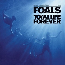
When looking at the indie genre we should expect to see a more relaxed and peaceful, perhaps sophisticated image from the digipak. This should be expected to link with themes in the song, however it may differ from other genres such as metal by subverting from the genre expectations and trying to achieve a more individualist band image. This can be shown in foals album: Total Life Forever. The use of the colour blue connotes a cool relaxed image whilst combining this with people swimming will make the digipak seem more serene and easy on the eye of the audience. Whereas colours such as red and black generally working to rile the audience and connote aggresssion and anger rather than passivness and neutrality.


0 comments:
Post a Comment