Kings of Leon have had mainstream success after releasing the album 'Only by the Night' the design of their digipak is the four faces of the band members cut into segments along with an image of an eagle, which has also been segmented. I believe that this was done in order to both depict what the band look like to the audience, thus allowing them to feel as if they are closer to the band and allowing them to identify with them. However the image of the eagle has been used to imply a specific meaning and promote a certain image that will accompany these faces. As Kings of Leon are an American band, I would argue that the eagle has been used to depict their roots as the bald eagle is the national bird of America. It could also be a link to the title: only by the night, as if to suggest that the eagle is a predator that only comes out at night. This would be supported by the shades of green that have been overlayed onto the image. The text is a lighter shade of green and has been styled to appear as a digital text. These colours are both associated with night vision and are strongly linked to the title in my opinion This seems to symbolise a military effect to the audience an can be linked to the night vision theme already mentioned.

The album 'contra' by Vampire weekend has also seen significant success in the mainstream indie market. The album cover is drawing upon the eighties image that the band try to depict by using a polaroid photo. This was a popular method of photography at the time and has recently seen a comeback in mainstream style. The text is large and very visible, enabling the audience to quickly identify the artist as well as making for a memorable cover by contrasting with the purple background. The use of costume for the girl on the cover is also being used to play up to the eighties image as polo shirts were widespread at the time and similarly to polaroid photos have been enjoying a steady comeback into mainstream style. Both of these themes make the band seem stylish and fashion aware. Meaning that their listeners may be inclined to follow their example. This could lead them to purchase more of the bands merchandise in order to further conform to the style of the genre.
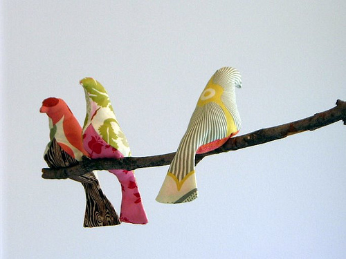
As can be seen, the cover of a digipak must be carefully pieced together by linking themes and ideas from the image of the band and incorporating it into an image that will quickly depict what the band may be like to potential audience members. For instance Our music video for 'souls on fire' displays the seperation and reunion of a couple in a band. We should use this as inspiration for our digipak cover, by considering images that also display these events, perhaps birds could be used as they are often seen in groups that sometimes appear divided

0 comments:
Post a Comment